
TrekAssist
Solar Powered Device for National Parks Service
Project TypeCoursework: Tufts University
October 2024 - December 2024
TimeLineRoleUI/UX Designer

Figma, Adobe Illustrator, Wireframes, Mood Board, Style Guide, Prototype, Usability Testing
Tools and MethodsBackground
TrekAssist is a solar-powered color e-ink device designed to enhance eco-tourism and visitor safety in U.S. national parks, starting with a pilot project in Yellowstone. It integrates real-time GPS, emergency services, multilingual guides, and eco-friendly tips, with an accessible and intuitive user interface tailored for diverse park visitors.
Problem
Visitors to national parks need an intuitive and accessible user interface that integrates navigation, safety alerts, and trip planning while addressing diverse user needs and increasing park donations.
Solution
Design a user-friendly and accessible interface for a solar-powered e-ink device that seamlessly integrates navigation, safety alerts, and trip planning while offering features to encourage donations and accommodate diverse user needs, enhancing the overall park experience.
❶ Home Screen
❷ Trip Planner
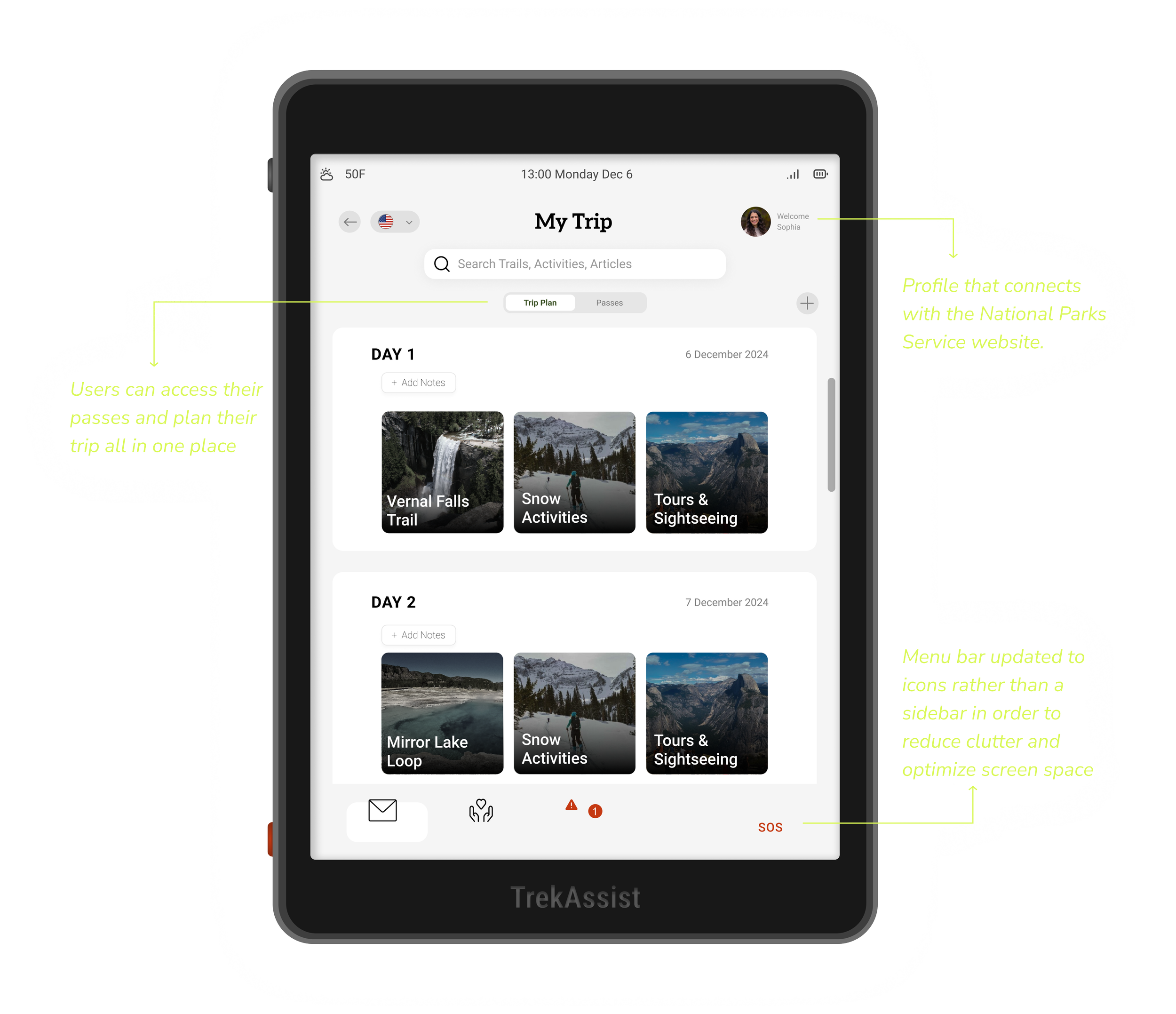
❸ Trail Information

❹ Donation

*
How’d we get to this solution?
We used the 5 Stages of the Design Thinking Process by the Interaction Design Foundation.

Initial user research wasn’t included in the scope of this project. Instead, the design was informed by the design needs specified in the brief, with novice hikers as the target audience.
Define
❶ Affinity Diagramming

We started with an affinity diagramming exercise to identify patterns and dependencies across requirements. By clustering related information, we were able to better understand trade-offs (like balancing color contrast and accessibility with power constraints) and align design decisions with both user and business priorities early in the process.
❷ Establishing Requirements
Following the affinity diagramming exercise, we synthesized our findings to connect user needs from the project brief with concrete design requirements that would guide ideation and prototyping.

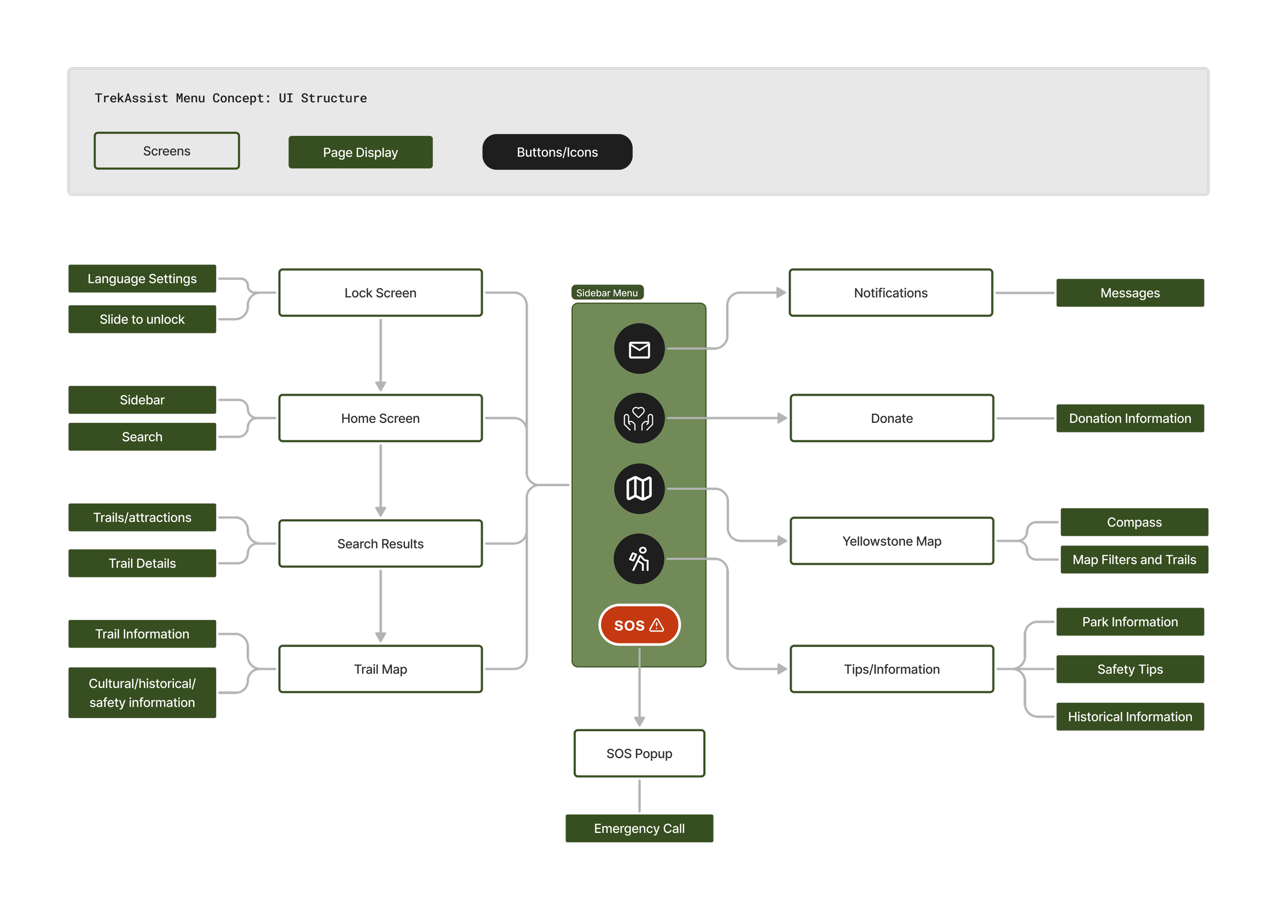
❸ Site Maps
We then translated the defined design requirements into a site map. Drawing from the affinity diagramming exercise, we developed two potential information architecture models.
The first was a menu-oriented structure, giving users access to most of the app’s features at any time. The second was a journey-centered structure, guiding users step by step through the trip-planning process. After evaluating both approaches, we decided to move forward with the menu-oriented user flow.
We chose the menu-oriented flow because it offered users greater flexibility and control, allowing them to access key features at any point in their journey rather than following a fixed sequence.
Ideate
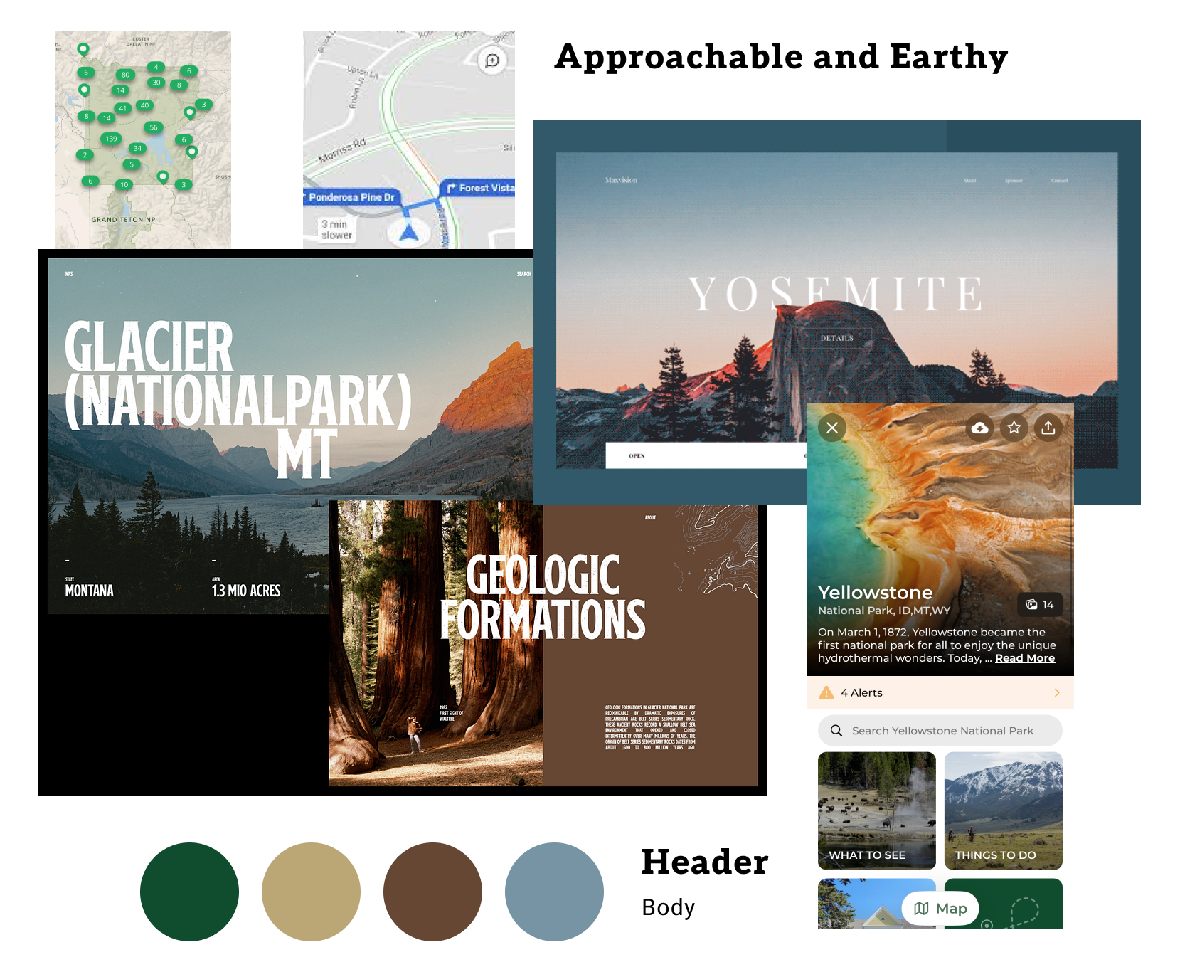
❶ Mood Board
This mood board draws inspiration from nature, blending a professional yet casual and approachable vibe. It encourages users to embrace the app’s safety and educational guidance while enjoying the fun and adventure of outdoor recreation.
❷ Wireframes
Due to time constraints, my team and I opted for hand drawn wireframes before moving on to creating the low fidelity prototype.

Prototype
❶ Style Guide
Typography
For typography, we chose a pair of sans serif and serif fonts. We opted to incorporate serif styles into specific aspects of the app, capitalizing on their ability to evoke a sense of history. Given Yellowstone's rich heritage which is prominently detailed in our app, it was essential our visual design reflect the same.

Colors
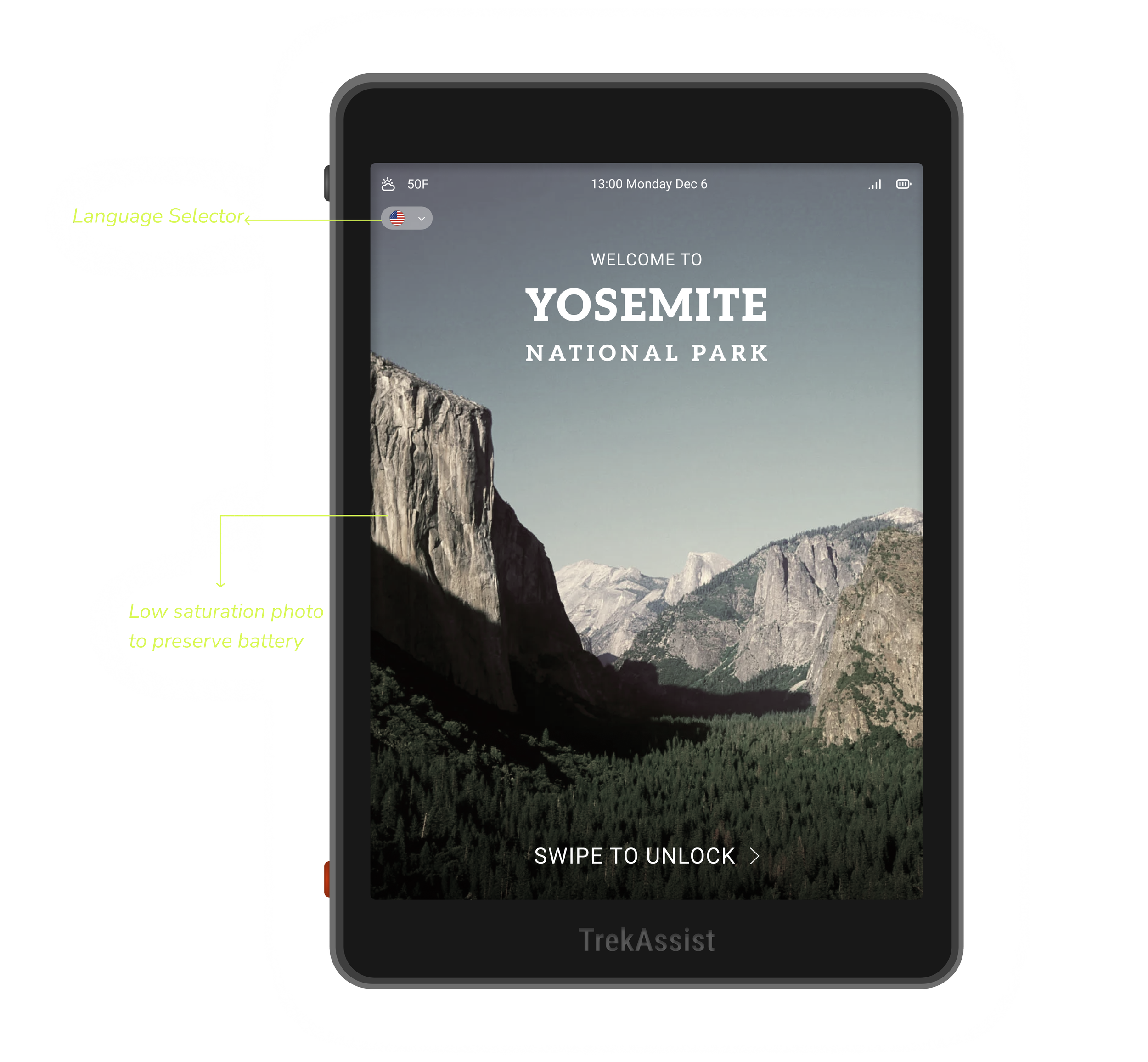
We decided on an earthy color scheme. We wanted our app to be reminiscent of the setting that the user would be in, so we chose greens and browns with red for emergency or alert features.

Icon Guidelines

Size: Minimum size for an icon is 16x16, max size 20x20.
Stroke: All icons should be outline with min 1.5px stroke, max 2.0px
Corner: All corners are rounded to invite a friendly, approachable feel
Photography

Low-saturation photography aligns with TrekAssist's power-conscious design philosophy
❷ Mid Fidelity Prototype
Using our wireframes and design system as a foundation, we created a medium fidelity prototype to serve as the basis for usability testing.

Test
❶ Evaluation Measures

SUS Scale and Exit Survey
We used the System Usability Scale (SUS) to gather quantitative data and evaluate how functional our prototype felt to users.
To complement this, our exit survey explored both numbers and narratives giving us a deeper look into how users experienced TrekAssist.
We asked questions like,
“To what extent do you trust TrekAssist to help keep park visitors safe from hazards like forest fires, dehydration, or animal-related injuries?”
“How likely would using TrekAssist make you to visit a national park again?”
These evaluation methods helped us understand how effectively our design met the requirements defined earlier in the process.
Key Outcomes (normalized to %)
Usability & UX quality Perception & behavior/intent
❷ Iteration Plan
Map
- Rearrange map interface for more interactive functions
Search
- Clarify purpose of the “star” button
Side Bar
- Reorder menu items for faster discovery
Donate
- Redesign flow with clear, guided steps
- Add payment methods
- Add recurring donation option
Plan a Visit
- Clearer wording
- Include more information for families
Trail Info
- Move safety info to a more visible place
Overall + New Adds
- Profile / settings tab
- “See Nearby” tab
Accessibility Additions
- Support horizontal orientation for limb differences
- Add text to speach as a tactile button

Six participants:
Range of experience with national parks (3 with none, 3 low to moderate)
Young adult to mid-age (range 18-64, median 27)
The interviews consisted of five tasks:
Exploratory Task
Language Selection Task
Finding Biscuit Basin Safety Information
Donation Task
Finding Snow Activities
An ease of use evaluation after each task that was rated on a 6 point Likert scale with one being very difficult and 6 being very easy. An overall satisfaction rating was also taken after the interview.
User Interviews
Reflection
With limited time, we focused on high-impact tweaks:
We clarified the donation flow and added a recurring donation option
Adjusted the feature orientation for better accessibility
Refined trail information to surface safety details more intuitively
Throughout this project, I sharpened my skills in conducting user interviews and synthesizing quantitative data from the SUS Scale alongside qualitative narratives from exit surveys to form a more complete picture of user experience. The affinity diagramming exercise demonstrated how clustering related information can reveal hidden patterns and help teams align on priorities early on. I also discovered the practical challenges of balancing competing design constraints, such as maintaining color contrast for accessibility while respecting power limitations on an e-ink device.
With more time, I would have run moderated and field usability tests with a broader user set, A/B-tested the donation and recurring flows, deepened accessibility/e-ink performance work, expanded offline trail info and error states, and iterated on the IA based on the testing outcomes.